OneAnalytics
Transforming Data Into Actionable Insights for General Practice
Primary Care IT’s OneAnalytics Platform turns complex practice data into clear, actionable insights that improve patient outcomes, streamline workflows, and optimise performance.
Reporting Areas
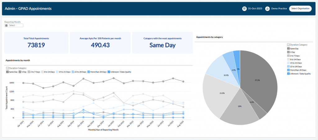
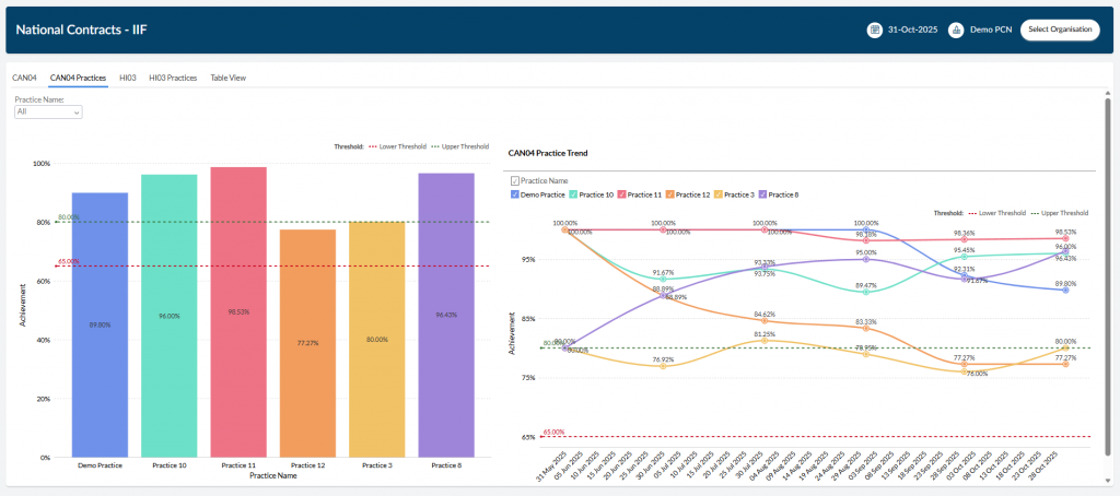
National Contract Performance
Easily track how your organisation is performing against national contracts such as GP Contract and Network Contract DES
Local Contract Performance
We can build bespoke reporting dashboards for you local enhanced services which will allow you to effectively monitor and mange your organisations performance.
Clinical Risk Monitoring
Identify your highest risk patients in areas such as frailty, cardiovascular risk, and blood pressures
Views for all organisations
The OneAnalytics portal support multiple levels of organisation. The portal provides a bespoke view of the data based on the level of organisation you are viewing.
Supported organisation types
Practice
PCN
Place
ICB
Empower your team
Easily invite other members of your team to the OneAnalytics portal to view your organisations data
Security
Multi Factor Authentication
Secure access using multi-factor authentication
Manage access to your data
Manage who can see your organisations data. Easily add and remove users from your organisations
Data Sensitivity
OneAnalytics protects your data and only shows what is necessary for the organisation you are viewing